
The color authority Pantone has released their palette for Spring 2015: see below how the Pantone hues can be translated for fashion. This season, cooler and softer color choices with subtle warm tones follow a minimalistic en plein air theme, taking a cue from nature. Love the colors! So natural and refreshing at the same time. Below you will also find the link of my Pantone colors Spring 2015 interiorblog about it.
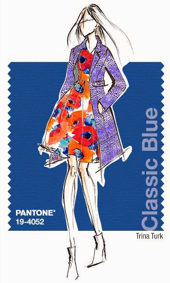
The Pantone fashion colors for Spring 2015 are: 14-4313 Aquamarine,16-4725 Scuba Blue, 14-5714 Lucite Green, 19-4052 Classic Blue, 14-1213 Toasted Almond , 16-1720 Strawberry Ice, 15-1247 Tangerine, 13-0720 Custard, 18-1438 Marsala, 14-4102 Glacier Gray.

This season there is a move toward the cooler and softer side of the color spectrum. An eclectic, ethereal mix of understated brights, pale pastels and nature-like neutrals take center stage as designers draw from daydreams of simpler times. Remembrances of retro delights, folkloric and floral art and the magical worlds of tropical landscapes restore a sense of well-being as we head into warmer months.
"Many feel compelled to be connected around the clock because we are afraid we'll miss something important. There is a growing movement to step out and create 'quiet zones' to disconnect from technology and unwind, giving ourselves time to stop and be still. Color choices follow the same minimalistic, 'en plein air' theme, taking a cue from nature rather than being reinvented or mechanically manipulated. Soft, cool hues blend with subtle warm tones to create a soothing escape from the everyday hustle and bustle"
Leatrice Eiseman / Executive Director, Pantone Color Institute®


Sources: Pantone/Fashion colors Spring 2015 and
for interior: Pantone/Interior colors Spring 2015 and
my Pantone colors Spring 2015 interiorblog
for interior: Pantone/Interior colors Spring 2015 and
my Pantone colors Spring 2015 interiorblog
Geen opmerkingen:
Een reactie posten