About Me

Mijn foto
Welcome! Thank you for visiting my weblog. I am Irene, Elisabeth Pouw, a Dutch blogger. As blogger I am connecting my readers with beauty, style, quality and craftsmanship in various subjects like interiordesign, architecture, haute couture, photography, art etc. I created this blog to share my passion for decorating as well as the many other things which inspire me. From time to time I am also highlighting certain interior designers, decorators, architects, stylists, photographers etc. I hope you enjoy your visit. Feel free to give a comment on my blogs. I will react back as soon as possible. Best regards, Irene Pouw from Holland.
Posts tonen met het label Decorating Ideas. Alle posts tonen

27 september 2025

Color Ideas: 12 Iconic Colors from around the World

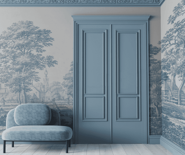
Would like to share with you these 12 iconic colors from around the world. What an inspiring colors to use for decorating your house. Each color has its own beauty. I can hardly choose. :-) My favourites are Chinese Red, Caribbean Blue, Burgundy, Tibetan Yellow, Jaipur Pink and Prussian Blue. Which colors do you prefer? This blogpost is a repost of my blog of 03-11-2020. Be Inspired .........

Jaipur Pink
"The whole city of Jaipur, India is painted pink. It's an exuberant color, optimistic and positive. Jaipur pink reminds us that we're all alive and everything is possible. I like this type of paint, because it has a chalky layer underneath that blooms through and gives it a patina. Try it with saffron and orange." — Windsor Smith.
Painting: Sydney Harbour Paints Lime Wash Pink Ginger.
Chinese Red
"In Chinese culture, red is the color of good fortune and you see it everywhere — on pagodas, on tugboats in Hong Kong harbor and on paper lanterns swaying in the breeze. This is my all-time favorite Chinese red, in high gloss — like the lacquered tip of one of Diana Vreeland's fingernails. Red is the great clarifier. A touch of it will add crispness to any room." — Miles Redd.
Painting: Benjamin Moore Impervo Alkyd High Gloss Brilliant Red 20.
Pompeian Red
"Pompeian Red is the red — with a bit of rusty orange — that you see in the background of all those frescoes in Pompeii. Amazing that they've survived for millennia. Red creates a wonderful contrast that brings everything else into focus. It's gorgeous, very Italian and very romantic. It has the glow of the sun in it." — Brian McCarthy.
Painting: Farrow & Ball Estate Emulsion Blazer 212.

Caribbean Blue
"My idea of Caribbean Blue is this gorgeous turquoise that takes me straight to the beach. It's the color of water in the sunlight with brightness as well as depth. And like all the Glidden blues, it has a beautiful undertone. It might be pretty intense in a whole room, but try it on one wall, a ceiling, shutters, or a door — all great ways to use a strong color." — Suzanne Kasler.
Painting: Glidden Premium Deepest Aqua GLB24.
Tangerine 
"Apparently the first tangerines were shipped to Europe from Tangier and the city gave its name to the fruit and the color. Try tangerine lacquered in a dining room or a foyer to envelop you with warmth and make you feel as if you've jumped on a jet to some exotic destination." — Jamie Drake.
Painting: Benjamin Moore Impervex Tangelo 2017-30.
Swedish Gray
"I've always responded to Swedish interiors, maybe it's the quality of the light. The color I think of as Swedish gray is subtle and complex. You can see other tones in it and that ambiguity is intriguing. Set it off with dark charcoal or bright white and a bouquet of pink garden roses." — Victoria Hagan.
Painting: Benjamin Moore Aura Feather Gray 2127-60.
Tibetan Yellow
"This is the color of the robes worn by Tibetan Buddhist monks. When you see them walking down the street, it's like a ray of sunshine. Tibetan yellow is vibrant, but somehow it still has a softness and a sense of peace." — Vicente Wolf.
Painting: Pittsburgh Paints Manor Hall Naple's Gold 116-7.
British Racing Green
"I think fondly of British racing green, as I had an MG in exactly this color when I was in my twenties. I would use it in high gloss for a library, because it gives a room lots of shine and drama, creating a cool, quiet space. It goes well with old leather bound books and comfortable furniture." — David Easton.
Painting: Benjamin Moore Advance Hunter Green 2041-10.
Burgundy
"The color Burgundy takes its name from the color of the wines made in the Burgundy region of France. And like a glass of my favorite Pinot Noir, this rich red has depth. It responds dramatically to light and shade. Recommended for rooms where you want to curl up and read." — Katie Ridder.
Painting: C2 Paint Luxe Curtain Call C2-004.
Chartreuse
"Chartreuse is such a happy, spirited color. The name comes from the yellow-green liqueur made by monks in the Chartreuse mountains of France. I tend to gravitate toward the yellow side of the spectrum, and this shade is so multifunctional and rich. It looks amazing with anything from ebonized woods to whites." — Kelly Wearstler.
Painting: Pratt & Lambert Accolade Casava 15-10.
Prussian Blue
"The formula for Prussian blue was born in what is now Poland. It was one of the first artificial pigments and replaced the ultra-expensive ultramarine, unleashing a tsunami of blue into the world. Without it, we wouldn't have those smart Prussian military uniforms or Picasso's Blue Period. I'd use it in a bedroom with crisp white trim." — Alexa Hampton.
Painting: Benjamin Moore Satin Impervo New York State of Mind.
Aegean White
"You see a particular shade of Aegean White all over the Greek islands, where the whitewashed houses seem to incandesce in the light. Each village looks as if it has been planted into the side of the cliff, and this lime-wash paint feels equally organic. I've used it in a dining room where the mottled, chalky texture creates a sense of age and looks beautiful in candlelight." — Darryl Carter.
Painting: Virginia Lime Works Limepaint Bright White.
Thank you for reading this blogpost. 
Source: House Beautiful

28 augustus 2025

Decorating: Delightful kids wallpaper 'Garden Friends' by Harlequin


 Could not resist to share with you today this delightful kids wallpaper design called 'Garden Friends'. It's with all kind of insect friends like Bob Butterfly basking in the sunshine or Wanda Worm wiggling in the soil. So cute to see ....... :-)  Earlier I wrote more blogs about wallpaper designs, SEE HERE Be Inspired ........


Thank you for reading this blogpost.
Source: HARLEQUIN
For more Inspiration, see also my PINTEREST account

15 augustus 2025

COLOR INSPIRATION - PURPLE, BLACK & GRAY HUES (82)

 As interiorblogger I am always looking for interesting color palettes which I can use for decorating rooms and to inspire my weblog readers. Below you will find this lovely and refined color palette in purple, black and gray hues. Earlier I wrote more blogs about color palettes, SEE HERE 


Thank you for reading this blogpost. 
Source: Design Seeds
For more photos, see also my Pinterest moodboard "Color Palettes" 

06 juni 2025

Favorite Painting Color: Great color called 'Magnolia Green' for the bathroom

Love this green painting color 'Magnolia Green' for the bathroom. Design Guru and Fixer Upper star Joanna Gaines revealed earlier her favorite paint color 'Magnolia Green' for bathrooms. Although this blog is a repost from my blogpost of 26-08-2018 I think it is still a timeless, fresh and elegant color to use. Be Inspired ......
Thank you for reading this blogpost.
Source: Elle DecorPh. via Country Living US.

20 januari 2025

Lighting Design: La Lampe Gras (02)

La Lampe Gras, icon of the 20th century
Be Inspired by this beautiful and timeless lighting design, La Lampe Gras. In 1922 Bernard-Albin GRAS designed a series of lamps for use in offices and in industrial environments. The GRAS lamp, as it was subsequently called, was astounding in its simple, robust and yet very ergonomic design. There are neither screws nor welded joints in the basic form. In 1927 the Ravel company purchased the patent and started production of the GRAS lamps. I wrote earlier ANOTHER BLOG about this inspiring lighting design. This blog is a repost of my blog of 19-07-2021

Bernard- Albin Gras was one of the most innovative designer of the 20th century. The functional esthetic of his lamps and especially the design of details such as those of the arms, stems, brackets and bases were truly original and far ahead of his time. Early on Le Corbusier was seduced by the modern design and user-friendliness of the lamps. He became one of Bernard-Albin GRAS’s most enthusiastic supporters using the lamps in his own offices as well as employing them in numerous architectural projects all over the world.

Others such as Robert Mallet-Stevens, Jacques Emile Ruhlmann and Eileen Gray followed this trend as well. Furthermore, such well-know artists as Sonia Delaunay and Georges Braque also used these lamps in their studios. For the first time in history, a lamp was equally popular in professional as well as in residential applications. Today, the GRAS lamp has become sought after a collector’s item all over the world, most notably in France, in the United States and in Japan. Bernard-Albin Gras’s talented and visionary design has proven to be timeless.
Thank you for reading this blogpost.
Photos: courtesy of La Lampe Gras. 
Source: LA LAMPE GRAS
For more Inspiration, see also my PINTEREST account

16 januari 2025

Wallpaper: Delightful & colorful wallpaper design Hide & Seek by Harlequin

 While surfing on internet today I found this lovely and colorful wallpaper design Hide & Seek by UK brand Harlequin. As day breaks, jumping foxes leap over fresh meadow flowers, playing a game of hide and seek in their wonderful outdoor world. Fluttering butterflies dance to the Blue Tit's song as bounding bunnies join in the fun. Everywhere you look, this beautifully hand painted design is full of life. This wallpaper is available in two colourways: Poppy/Marine/Ochre and Linen/Duck Egg/Stone. Be Inspired ........


Thank you for reading this blogpost.
Source: Harlequin
For more Inspiration, see also my PINTEREST account

01 januari 2025

Decorating: A classic, timeless & elegant interior with wallpaper Italianate Blue

Would like to share with you this sophisticated wallpaper 'Italianate Blue' in a soft blue tone. It's perfect for a classic and timeless interior with an elegant touch. The Dutch company The Wallhouse NL is offering this beautiful wallpaper. The soft blue painted door as well as the moulding are matching very well. This blogpost is a repost of my post of 06-03-2022. Be Inspired .......

More about the designers  Anneclaire and Esmee
Anneclaire (Design)
Before Anneclaire started with The Wallhouse she gained experience as a designer at the company Adidas and she worked amongst other things as interiorstylist and graphic designer. She has graduated at the Amsterdam Fashion Institute (AMFI) for Fashion Design. At The Wallhouse Anneclaire is responsible for the design of the prints, advice and personalities. 

Esmee (styling and sales)
Esmee is an interior- and garden designer. She has a predilection for personal interior- and stylingadvice. She feels like no other how the designs of The Wallhouse can fit in your personal environment. 

Anneclaire and Esmee started in 2020 with The Wallhouse. With this formula they break open existing frames with the combination of different styles, personal attention and custom-made solutions. In this way every assignment becomes an unique experience. For more inspiring ideas, see their website or Instagram account, see the links below.

Thank you for reading this blogpost.
Sources: The Wallhouse NL and INSTAGRAM
e: anneclaire@thewallhouse.nl and e: esmee@thewallhouse.nl
For more Inspiration, see also my PINTEREST account

22 december 2024

09 november 2024

Lighting Design: Beautiful Zoffany lighting collection by Heathfield (04)

While surfing on Twitter today I found these beautiful table lamps from the UK company Zoffany. These designs are great lamps to enhance and enrich your house in an elegant & stylish way. Zoffany has designed and created an exclusive collection of bespoke interior lighting In collaboration with Heathfield and Co. I checked both their websites and was very impressed about the glamorous and beautiful products they are offering. Just take a look at their websites mentioned below. I am sure you will be surprised. Earlier I wrote more blogs about Heathfield


Thank you for reading this blogpost!
Sources: ZOFFANY and HEATHFIELD
For more Inspiration, see also my PINTEREST account

20 september 2024

WALLPAPER INSPIRATION - HARLEQUIN (02)

While surfing on Twitter today I found this beautiful wallpaper from the UK brand Harlequin. This one is from the serie "Radiance". It's a delicate blossom trail in a pearlescent finish. What a lovely & refined wallpaper design as well as colour, also available in other colours. This blogpost is a repost from my post of 21-04-2015. Be Inspired ........
Thank you for reading this blogpost.
Source: Harlequin UK
For more Inspiration, see also my PINTEREST account

31 augustus 2024

John Jacob Interiors - Glamorous interior design


While surfing on internet I found this glamorous interior design from interior designer John Jacob Interiors. Love his use of colours, the elegant style and the harmony in this interior. Be Inspired .......  
Thank you for reading this blogpost.
Sources: John Jacob Interiors and The Decorista
For more Inspiration, see also my PINTEREST account