About Me

Mijn foto
Welcome! Thank you for visiting my weblog. I am Irene, Elisabeth Pouw, a Dutch blogger. As blogger I am connecting my readers with beauty, style, quality and craftsmanship in various subjects like interiordesign, architecture, haute couture, photography, art etc. I created this blog to share my passion for decorating as well as the many other things which inspire me. From time to time I am also highlighting certain interior designers, decorators, architects, stylists, photographers etc. I hope you enjoy your visit. Feel free to give a comment on my blogs. I will react back as soon as possible. Best regards, Irene Pouw from Holland.
Posts tonen met het label Color Forecasts. Alle posts tonen

16 april 2026

Tailored & Timeless: Color of the Year 2026 - Universal Khaki - Sherwin-Williams


Sherwin-Williams Universal Khaki living room; Photo courtesy of Sherwin-Williams

Sherwin-Williams’ Trendsight Team has announced the Sherwin-Williams Color of the Year for 2026: Universal Khaki SW 6150, a tailored and timeless neutral with the endless possibility of a fresh canvas. They selected this color for its beautiful balance of livability and longevity.

''Universal Khaki is unmistakably classic and at the same time forward reaching. It represents traditional values reimagined for today’s color space, breathing new life into this staple hue''.

— Maggie O’Hare Global CMF & Trend Manager, Industrial Wood Coatings

From Classic to Contemporary: Khaki trough History
“There’s something enduring about khaki — it bridges the past and the future in a way that feels both familiar and forward-thinking,” says Trendsight Team color strategist and Director of Color Marketing Sue Wadden. “Historically, khaki dates back to the mid-19th century. The name comes from a Persian word meaning ‘dust’ or ‘earth,’ in reference to the color’s nature-based tone.”

Sue points out that utility clothing in an olive, gray or khaki tone has long been a practical choice of uniform colors throughout history and by the early 20th century, khaki found its way into everyday fashion, making it a popular choice in workwear, outdoor clothing and casual wear. It is now widely associated with comfort, craftsmanship and versatility.

In commercial design — such as hotels and restaurants, wellness environments and modern offices — Sue says that Universal Khaki brings a sense of stability, understated sophistication and a dose of warmth, especially in the current landscape of adaptive-reuse buildings. “It’s ideal for wall finishes, flooring and branded elements, especially when paired with matte black or brushed bronze for added depth.” 

“Across Latin America — especially in Brazil — we’re witnessing a shift in what luxury means,” says PatrĂ­cia Fecci, Color Marketing Manager of Sherwin-Williams Brazil and member of the Trendsight Team. “It’s no longer about excess. It’s about authenticity, memory and materials with soul. Universal Khaki fits perfectly into this new narrative.”

Core neutrals are fundamental to this design philosophy — timeless shades known for their longevity and reliability. “Understated and hardworking, warmer neutrals like Universal Khaki blend seamlessly with their counterparts and provide a foundation that sets the tone for an entire design,” adds Sue Wadden. This is why contemporary khakis are found in such a wide variety of settings — and why their experts see it as a color worth reaching for and reinventing again and again.

Color of the Year 2026 Sherwin-Williams - Universal Khaki SW 6150

Coordinating Colors with Universal Khaki
Universal Khaki, its beauty lies in its versatility. Sue Wadden says she envisions countless pairings to achieve a wide range of different moods and aesthetics: “For a warm, desert-inspired softness, Universal Khaki paired with Henna Shade is a combination that feels sunbaked and serene. You can achieve a bold, dramatic look by layering it with Dark Auburn or Tarragon, introducing rich, deep tones that add depth and sophistication. If you’re leaning into a neutral maximalist approach, Universal Khaki balances with White Snow and Cream and Sugar — a clean white and a soft creamy tone that together create a subtle interplay of cool and warm.” See the color palette below. Hope this article inspires you ......... You can find additional information in the links below. For my 2nd article about Colors of the Year 2026, see this link HERE

Coordinating Colors with Universal Khaki

Thank you for reading this blogpost.
Sources: Sherwin-Williams, Fashion Trendsetter and BING
Photos: courtesy of Sherwin-Williams

02 maart 2026

Color Inspiration: 10 beautiful living room paint colors for 2026

Would like to share with you today 10 beautiful paint colors for 2026 for the living room. The living room paint colors of 2026 are changing and they’re nothing like what you see everywhere today. In this video below, we reveal 10 living room paint colors for 2026 you’ve probably never seen before, carefully selected from top brands like Farrow & Ball, Benjamin Moore, Sherwin-Williams, Behr and PPG. They are future-proof, designer-approved shades that create calm, warmth and luxury in real homes. From aged pistachio greens and sophisticated olive tones, to dusty cedar, deep pewter, pale ochre, smoky aubergine and dusty apricot, this video explores how color is becoming more emotional, grounded and human in 2026 interior design. I made some photos from the video to give you a 1st impression. However, in the enclosed video below you will find a complete summary with thanks to 'Best Color Design'. Be Inspired ........

The paint colors for living rooms for 2026 are:
1. Pistachio - Farrow & Ball
2. Ancient Marble - Sherwin-Williams
3. Cedar Ridge - Benjamin Moore
4. Red Clay - Behr
5. Night Watch - PPG
6. Iron Mountain - Benjamin Moore
7. Hay - Farrow & Ball
8. Dark Olive - Benjamin Moore
9. Blackberry - Sherwin-Williams
10. Setting Plaster - Farrow & Ball.


Thank you for reading this blogpost.
Source: Best Color Design via You Tube

16 december 2025

Fashion: Inspiring Color Trends 2026 - Chic, Elegant & Effortless

 While surfing on You Tube tonight I saw this video from 'Timeless Elegance Style' with inspiring color trends for fashion for 2026. 
2026 is bringing a new wave of color - calm, refined and quietly confident. This year, elegance isn’t about being bold; it’s about being intentional and thoughtfully elevated. We’re moving away from loud, fast trends and embracing shades that feel timeless, graceful and deeply sophisticated. Think of colors that whisper luxury - soft neutrals, muted tones and gentle contrasts that look effortlessly polished in any setting. In this video, 'Timeless Elegance Style' show you the most elegant color trends of 2026. The shades that make your wardrobe feel refined, your style more elevated and your presence unforgettable. Be Inspired ........


Thank you for reading this blogpost.
Source: Timeless Elegance Style via You Tube

Renovation: Colors of the Year for 2026 from 10 major paint brands


Would like to share with you this You Tube video below from Best Color Design. They made an interesting video about the Colors of the Year for 2026 from 10 major paint brands. Beautiful colors, peaceful, elegant and refreshing ....... I made some photos with my mobile phone to give you a first impression. However, this video gives an excellent summary of 10 colors totally. Be Inspired ..........

 As we step into 2026, the global mood is crystal clear: we're craving balance, warmth and calm rejuvenation. Below you will find the Colors of the Year for 2026 from 10 major paint brands, like soft earthy tones, comforting neutrals and rich hues that speak to inner peace and creativity. Whether you're planning a full home makeover or just refreshing one room, this is your ultimate guide to the best paint colors defining 2026.

THE 10 COLORS OF THE YEAR 2026:

1. Sherwin-Williams Universal Khaki - warm grounded neutral

2. Behr Hidden Gem - deep luxurious teal

3. HGTV Home Universal Khaki - versatile comfort-driven neutral

4. Glidden Warm Mahogany - rich reddish-brown

5. Valspar Warm Eucalyptus - soft green with gray undertones

6. Dutch Boy Melodious Ivory - warm creamy off-white

7. Krylon Coffee Bean - bold espresso-brown

8. Graham & Brown Divine Damson - opulent plum-purple

9. C2 Paint Epernay - sophisticated beige-pink neutral

10. Dulux Shades of Blue - complete blue palette collection

These interior paint colors work beautifully for living rooms, bedrooms, kitchens and home exteriors. From neutral paint colors like Universal Khaki and Melodious Ivory to bold statement hues like Hidden Gem and Divine Damson, these wall paint colors capture exactly what we're feeling right now: a desire for balance, comfort and meaningful beauty in our homes.

Which color resonates most with your personal style? Just let me know in the comment ....... 


Thank you for reading this blogpost.
Source: Best Color Design on You Tube

21 september 2018

Painting Colors: Sherwin-Williams reveals its 2019 Color of the Year - Cavern Clay

Sherwin-Williams has revealed an earthy hue, Cavern Clay SW 7701, as its 2019 Color of the Year. The company describes Cavern Clay as a "warm terracotta color with ancient, elemental roots". They explain that it's a "nod to midcentury modern style, but with the soul of the American Southwest which together create the desert modern aesthetic." Ideal for both homes and commercial spaces, the rich color, which brings to mind the beauty of nature (think beaches, canyons and deserts) works beautifully with neutrals. A warm gray or deep brown like the company's Moth Wing and Dark Clove are ideal pairings. If you're a bit more adventurous with your decor choices, Sherwin-Williams' Distance, a dusty denim blue and Haven, a soft shade of green, are ideal choices.
“We believe 2019 will be a renaissance of the 1970s - with a twist. In the coming year, we will embrace our pioneering spirits and artisan ingenuity,” says Sue Wadden, director of color marketing, Sherwin-Williams. “Our 2019 Color of the Year, Cavern Clay, embodies renewal, simplicity and free-spirited, bohemian flair.” Be Inspired ......
Thank you for reading this blogpost.
Sources: ELLE DECOR and Sherwin-Williams

16 december 2017

Color Forecasts: Pantone names Ultra Violet as Color of the Year 2018 (02)


With 2018 just around the corner, Color company Pantone has chosen a vibrant purple shade, named Ultra Violet, as its color of the year for 2018. The Ultra Violet color is described by Pantone as "a dramatically provocative and thoughtful purple shade". Ultra Violet or Pantone 18-3838, is a complex, celestial shade of purple, veering toward the cooler end of the color spectrum, that calls to mind the vastness of the galaxy, the power of spirituality and creative expression in all its forms. I wrote more blogs about Ultra Violet, Color of the Year 2018
Leatrice Eiseman, Executive Director of the Pantone Color Institute, tells that purple has rich, transcendent associations, noting," It's often associated with mindfulness practices. So it has that spiritual or mystical quality that's attached — a little bit of magic that's inferred in the color." Certainly, purples of every shade are deeply evocative. Purple has been associated with royalty, wealth, complexity, craftsmanship, ecclesiastical power and counterculturalism. Eiseman describes it as "nonconforming." It's a potent and resonant hue. Still, it's wonderfully — surprisingly — accessible.
Its worth noting that purple has a tendency to come into vogue at important turning points in history. Also that turbulent times are often, in their turn, crucibles for artistic expression. Purple was a favorite color of the Fauvists in the revolutionary first decade of the twentieth century. It had a heyday with musical artists like Jimi Hendrix in the late 60s and early 70s, at the apex of the Countercultural movement. Be Inspired .......
Thank you for reading this blogpost.

11 oktober 2014

INTERIOR: Pantone's Spring 2015 Color Report

How to use Pantone's Spring 2015 color report at home. 

The color authority has released their palette for Spring 2015. This season, cooler and softer color choices with subtle warm tones follow a minimalistic en plein air theme, taking a cue from nature. See how the Pantone hues can be translated easily and chicly for the home. Love the colors! So natural and refreshing at the same time. Below you will also find the link of my Pantone colors Spring 2015 fashionblog about it.

The Pantone fashion colors for Spring 2015 are: 14-4313 Aquamarine,16-4725 Scuba Blue, 14-5714 Lucite Green, 19-4052 Classic Blue, 14-1213 Toasted Almond , 16-1720 Strawberry Ice, 15-1247 Tangerine, 13-0720 Custard, 18-1438 Marsala, 14-4102 Glacier Gray.
As seen here in a living room designed by Alex Papachristidis
Explanation from Leatrice Eiseman:

This season there is a move toward the cooler and softer side of the color spectrum. An eclectic, ethereal mix of understated brights, pale pastels and nature-like neutrals take center stage as designers draw from daydreams of simpler times. Remembrances of retro delights, folkloric and floral art and the magical worlds of tropical landscapes restore a sense of well-being as we head into warmer months.
As seen here in a kitchen designed by Eric Gartner

Continuation text Leatrice Eiseman/Pantone:
"Many feel compelled to be connected around the clock because we are afraid we'll miss something important. There is a growing movement to step out and create 'quiet zones' to disconnect from technology and unwind, giving ourselves time to stop and be still. Color choices follow the same minimalistic, 'en plein air' theme, taking a cue from nature rather than being reinvented or mechanically manipulated. Soft, cool hues blend with subtle warm tones to create a soothing escape from the everyday hustle and bustle"
Leatrice Eiseman / Executive Director, Pantone Color Institute®
As seen here in a drawing room designed by Mehall Griffey and Jerry Maggi
As seen here in a kitchen designed by Kelly Wearster
As seen here in a lfront parlor designed by Thomas Jayne
As seen here in a dining room designed by Lorenzo Castillo
As seen here in a dining room designed by Michael Coorengel
As seen here in a dining room designed by Peter Mikic
As seen here in a screening room designed by Martyn Lawrence Bullard
As seen here in a dining room designed by Susan Hable Smith
As seen here in a living room designed by Victoria Hagan 
As seen here in a bedroom designed by Richard McGeehan
As seen here in a dining room designed by Susan Hable Smith
As seen here in a living room designed by Richard Mishaan
As seen here in a living room designed by JoĂ£o Mansur
As seen here in a bath designed by Nathaniel Goldberg
Thank you for reading this blogpost.
Sources: ELLE DECOR, 
PANTONE/Fashion Color Report Spring 2015 and 
my Pantone colors Spring 2015 fashionblog 

FASHION: PANTONE COLORS SPRING 2015

Spring 2015: En Plein Air. 
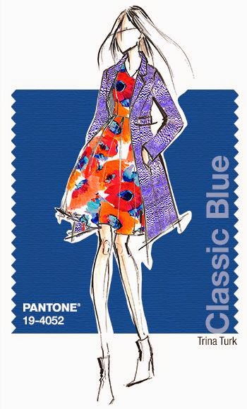
The color authority Pantone has released their palette for Spring 2015: see below how the Pantone hues can be translated for fashion. This season, cooler and softer color choices with subtle warm tones follow a minimalistic en plein air theme, taking a cue from nature. Love the colors! So natural and refreshing at the same time. Below you will also find the link of my Pantone colors Spring 2015 interiorblog about it.

The Pantone fashion colors for Spring 2015 are: 14-4313 Aquamarine,16-4725 Scuba Blue, 14-5714 Lucite Green, 19-4052 Classic Blue, 14-1213 Toasted Almond , 16-1720 Strawberry Ice, 15-1247 Tangerine, 13-0720 Custard, 18-1438 Marsala, 14-4102 Glacier Gray.
Explanation from Leatrice Eiseman:
This season there is a move toward the cooler and softer side of the color spectrum. An eclectic, ethereal mix of understated brights, pale pastels and nature-like neutrals take center stage as designers draw from daydreams of simpler times. Remembrances of retro delights, folkloric and floral art and the magical worlds of tropical landscapes restore a sense of well-being as we head into warmer months. 
Continuation text Leatrice Eiseman/Pantone
"Many feel compelled to be connected around the clock because we are afraid we'll miss something important. There is a growing movement to step out and create 'quiet zones' to disconnect from technology and unwind, giving ourselves time to stop and be still. Color choices follow the same minimalistic, 'en plein air' theme, taking a cue from nature rather than being reinvented or mechanically manipulated. Soft, cool hues blend with subtle warm tones to create a soothing escape from the everyday hustle and bustle"
Leatrice Eiseman / Executive Director, Pantone Color Institute®