About Me

Mijn foto
Welcome! Thank you for visiting my weblog. I am Irene, Elisabeth Pouw, a Dutch blogger. As blogger I am connecting my readers with beauty, style, quality and craftsmanship in various subjects like interiordesign, architecture, haute couture, photography, art etc. I created this blog to share my passion for decorating as well as the many other things which inspire me. From time to time I am also highlighting certain interior designers, decorators, architects, stylists, photographers etc. I hope you enjoy your visit. Feel free to give a comment on my blogs. I will react back as soon as possible. Best regards, Irene Pouw from Holland.
Posts tonen met het label Color Inspiration. Alle posts tonen

13 augustus 2026

COLOR INSPIRATION - FLOATING TONES (06)

As blogger I am always looking for interesting color palettes which I can use to inspire my weblog readers. Below you will find the color palette 'Floating Tones'. What a lovely color palette! Such an elegant combination. Love them all. I published this blogpost earlier on 12-11-2014. This is a repost. Be Inspired .......
Source: Design SeedsFor more photos, 

15 juli 2026

Colors: Delicious color palettes by Irene (02)

Would like to share with you today this delicious color palette in beige, soft pink and turquoise hues. What a delightful color combination! On my PINTEREST account I am sharing lots of more colorpalettes. Be Inspired ......
Thank you for reading this blogpost. 
Sources: Pinterest and Design Seeds

23 juni 2026

Abstract Art: Inspiring artwork from the artist Ursula J. Brenner (02)

Would like to share with you this inspiring artwork from the artist Ursula J. Brenner. Love the way she is using contrasts in form and color to underscore emotion in her pieces. Be Inspired ....... Will publish on 15-08-2026 her other artwork called "Royal Blue Abstract". Earlier I wrote more blogs about 'ART', SEE HERE


The artist Ursula J. Brenner
More about the artist
Ursula J. Brenner creates a diverse array of landscapes and contemporary abstracts in acrylics and encaustics, using contrasts in form and color to underscore emotion in each piece. Ursula’s art reflects a wide range of moods, from light and playful to deep and mysterious. Born in Germany, Ursula has been influenced by a rich cultural background of old world museums, art, music and architecture. She lives and works in Cincinnati, Ohio, where she attended Edgecliff College on scholarship, graduating in 1978 with a BA in Drawing and Painting.

She has studied with and been influenced by the work of Wolf Kahn, Susan Sarback, Doug Dawson and Albert Handell. Always filled with ideas, Ursula can be as inspired by driving in the country as looking through a magazine. She likes to focus on the fundamental nature of a scene – the values, colors and shapes -using a “notan” study, a Japanese method of examining lights and darks. She enjoys alternating between landscapes and abstracts to keep her interest in both genres high. Ursula experiences a spiritual connection as she creates art, something she wants the viewer to experience as well. “My art makes a strong, bold statement, an unambiguous statement,” says the artist. “Yet it can be very ethereal too.I want people who look at my art to be transported into another realm, to transcend the normal human experience.”

Ursula is represented by selected galleries. Her paintings are featured in private and corporate collections internationally, She works with interior designers and art consultants and accepts commissioned work. A national award-winning artist, Ursula was chosen to attend the Vermont Studio Center on partial scholarship in 2002.
Thank you for reading this blogpost.

21 juni 2026

Color Inspiration: Summer Colorpalette 5

 Would like to share with you today this lovely Summer color palette in blue hues combined with soft pink & soft yellow. What a delightful color combination! On my PINTEREST account I am sharing lots of more color palettes. For more inspiration see also my PREVIOUS COLOR BLOGS. Be Inspired ......
Thank you for reading this blogpost. 
Sources: Pinterest and Design Seeds.

10 mei 2026

Color Inspiration: Happy Yellow (03)

Yellow is one of my favourite colors as this color really makes me smile. Yellow looks also so cheerful and sunny. :-) Would like to share with you some delightful yellow photos for architecture, fashion, flowers and interior design. Just enjoy the beauty of yellow ...... Earlier I wrote more blogs about Colors, SEE HERE This is a repost of my blogpost of 26-09-2015.
What a lovely yellow spiral staircase. 
At the beach in yellow.
A yellow chapel in Santorini, Greece.
BELIEVE IN YOURSELF.
Lovely in Yellow.
Sunny Yellow.
Yellow coiffeur shop.

Thank you for reading this blogpost.
Photos found on Pinterest and Google+.

16 april 2026

Tailored & Timeless: Color of the Year 2026 - Universal Khaki - Sherwin-Williams


Sherwin-Williams Universal Khaki living room; Photo courtesy of Sherwin-Williams

Sherwin-Williams’ Trendsight Team has announced the Sherwin-Williams Color of the Year for 2026: Universal Khaki SW 6150, a tailored and timeless neutral with the endless possibility of a fresh canvas. They selected this color for its beautiful balance of livability and longevity.

''Universal Khaki is unmistakably classic and at the same time forward reaching. It represents traditional values reimagined for today’s color space, breathing new life into this staple hue''.

— Maggie O’Hare Global CMF & Trend Manager, Industrial Wood Coatings

From Classic to Contemporary: Khaki trough History
“There’s something enduring about khaki — it bridges the past and the future in a way that feels both familiar and forward-thinking,” says Trendsight Team color strategist and Director of Color Marketing Sue Wadden. “Historically, khaki dates back to the mid-19th century. The name comes from a Persian word meaning ‘dust’ or ‘earth,’ in reference to the color’s nature-based tone.”

Sue points out that utility clothing in an olive, gray or khaki tone has long been a practical choice of uniform colors throughout history and by the early 20th century, khaki found its way into everyday fashion, making it a popular choice in workwear, outdoor clothing and casual wear. It is now widely associated with comfort, craftsmanship and versatility.

In commercial design — such as hotels and restaurants, wellness environments and modern offices — Sue says that Universal Khaki brings a sense of stability, understated sophistication and a dose of warmth, especially in the current landscape of adaptive-reuse buildings. “It’s ideal for wall finishes, flooring and branded elements, especially when paired with matte black or brushed bronze for added depth.” 

“Across Latin America — especially in Brazil — we’re witnessing a shift in what luxury means,” says Patrícia Fecci, Color Marketing Manager of Sherwin-Williams Brazil and member of the Trendsight Team. “It’s no longer about excess. It’s about authenticity, memory and materials with soul. Universal Khaki fits perfectly into this new narrative.”

Core neutrals are fundamental to this design philosophy — timeless shades known for their longevity and reliability. “Understated and hardworking, warmer neutrals like Universal Khaki blend seamlessly with their counterparts and provide a foundation that sets the tone for an entire design,” adds Sue Wadden. This is why contemporary khakis are found in such a wide variety of settings — and why their experts see it as a color worth reaching for and reinventing again and again.

Color of the Year 2026 Sherwin-Williams - Universal Khaki SW 6150

Coordinating Colors with Universal Khaki
Universal Khaki, its beauty lies in its versatility. Sue Wadden says she envisions countless pairings to achieve a wide range of different moods and aesthetics: “For a warm, desert-inspired softness, Universal Khaki paired with Henna Shade is a combination that feels sunbaked and serene. You can achieve a bold, dramatic look by layering it with Dark Auburn or Tarragon, introducing rich, deep tones that add depth and sophistication. If you’re leaning into a neutral maximalist approach, Universal Khaki balances with White Snow and Cream and Sugar — a clean white and a soft creamy tone that together create a subtle interplay of cool and warm.” See the color palette below. Hope this article inspires you ......... You can find additional information in the links below. For my 2nd article about Colors of the Year 2026, see this link HERE

Coordinating Colors with Universal Khaki

Thank you for reading this blogpost.
Sources: Sherwin-WilliamsFashion Trendsetter and BING
Photos: courtesy of Sherwin-Williams

16 maart 2026

ART: KAREL APPEL, THE AVANT-GARDIST COBRA (02)

I admire the spontaneous abstract work by Dutch artist Karel Appel. Below you will find a painting from him, some additional information about him as a painter and several links, which I found after my research on internet. Last year I bought several blank canvases, paint as well as some knifes to start painting myself. Would love to paint in a spontaneous way like he did do. Will start soon. :-) Earlier I wrote more blogs about Art, SEE HERE
Christiaan Karel Appel was a Dutch painter, sculptor, poet and one of the founders of the avant-garde movement CoBrA. Karel Appel was born on 25 April 1921 at Dapperstraat 7 in Amsterdam, Netherlands. At fourteen, he produced his first real painting on canvas, a still life of a fruit basket. For his fifteenth birthday, his uncle gave him a paint set and an easel, and also taught him painting briefly. Appel studied at the Rijksakademie van Beeldende Kunsten in Amsterdam, where he meet the dutch painter Corneille and some years later, Constant; they became close friends for years. 
Karel Appel (1982). Ph. Nationaal Archief.
In 1948 Appel joined CoBrA (from:Copenhagen, Bruxelles, Amsterdam) with Corneille, Constant and Jan Nieuwenhuys and the Belgian poet Christian Dotremont. This artistic movement was formed with a unifying doctrine of complete freedom of colour and form, as well as antipathy towards Surrealism.Their working method was based on spontaneity and experiment, and they drew their inspiration in particular from children’s drawings, from primitive art forms and from the work of Paul Klee and Joan Miró. The new art of the CoBrA-group was not popular in the Netherlands, but it found a warm and broad welcome in Denmark. 

As a result of this controversy and other negative Dutch reactions to CoBrA, Appel moved to Paris in 1950 and developed his international reputation by travelling to Mexico, the USA, Yugoslavia and Brazil. Appel died on 3 May 2006 in his home in Zürich, Switzerland. 

Watch here the great Cobra painter in action in this video from 1962 where we can see him in real life. 
1962. Karel Appel shows how a real "cobra-artist" paint!

Thank you for reading this blogpost!
Sources: Moma.orgWikipedia and Wikipedia/Cobra

02 maart 2026

Color Inspiration: 10 beautiful living room paint colors for 2026

Would like to share with you today 10 beautiful paint colors for 2026 for the living room. The living room paint colors of 2026 are changing and they’re nothing like what you see everywhere today. In this video below, we reveal 10 living room paint colors for 2026 you’ve probably never seen before, carefully selected from top brands like Farrow & Ball, Benjamin Moore, Sherwin-Williams, Behr and PPG. They are future-proof, designer-approved shades that create calm, warmth and luxury in real homes. From aged pistachio greens and sophisticated olive tones, to dusty cedar, deep pewter, pale ochre, smoky aubergine and dusty apricot, this video explores how color is becoming more emotional, grounded and human in 2026 interior design. I made some photos from the video to give you a 1st impression. However, in the enclosed video below you will find a complete summary with thanks to 'Best Color Design'. Be Inspired ........

The paint colors for living rooms for 2026 are:
1. Pistachio - Farrow & Ball
2. Ancient Marble - Sherwin-Williams
3. Cedar Ridge - Benjamin Moore
4. Red Clay - Behr
5. Night Watch - PPG
6. Iron Mountain - Benjamin Moore
7. Hay - Farrow & Ball
8. Dark Olive - Benjamin Moore
9. Blackberry - Sherwin-Williams
10. Setting Plaster - Farrow & Ball.


Thank you for reading this blogpost.
Source: Best Color Design via You Tube

10 februari 2026

Stunning dark grey kitchen design with a reclaimed wood island

I am totally in love with this beautiful kitchen design in dark grey with a reclaimed wood kitchen island. What a fantastic result! This kitchen has been renovated by Interior Design Studio Rafterhouse. Rafterhouse builds and remodels homes in the greater Phoenix Metropolitan Area. Their aesthetic values are rooted in the Arcadia community. For more photos, see the direct link below to their projectnr. 4117. Be Inspired ........
Thank you for reading this blogpost.
Sources: DECOHOLIC and RAFTERHOUSE

01 februari 2026

Decorating Ideas: Gorgeous Color and Styling Inspiration by Jotun


While surfing on internet this afternoon I came across some gorgeous color and styling inspirations from the 
Norwegian paint company and color specialist Jotun. Although the colors are from their 2019 collection, I find the colors very timeless, beautiful and refined. Lovely color palettes with warm earthy colors, soft neutrals and shades of green. I added several links below for your information. Be Inspired ........ Earlier I wrote more blogs about 'COLORS'SEE HERE


Thank you for reading this blogpost.
Sources: Nordic DesignJotun and Eclectic Trends
Styling: Krakvik Dorazio
Photography: Line Klein

18 december 2025

Abstract Art: Inspiring artwork by German artist Christian von Grumbkow (05)


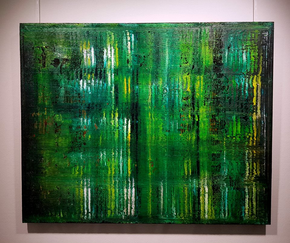
Earlier I discovered these abstract paintings from the German artist Christian von Grumbkow. I was immediately touched by his colorful pieces as well as his expressive coloruse in green hues. Therefore I decided, in cooperation with him, to write several blogs about his inspiring and versatile art. I am sure you will be surprised too! Below you will find information about him as an artist, his background and for which reasons he likes to touch other people spiritually by creating this kind of art. For more blogs about this inspiring artist, see THIS LINK This blogpost is a republish of my blog of 17-05-2019. Be Inspired ..........
More about the artist
Christian von Grumbkow is a German artist born in 1946 in Oberhausen, Germany and he is painting since he has the age of 3 years old. He is very well experienced as an international artist for more than 40 years. He had more than 300 exhibitions from 1971 untill 2018 in Germany, Belgium, Holland, Italy, Spain, Austria, the UK, U.S.A., Canada, Poland, France. 
BIOGRAPHY:
Christian followed from 1966 - 1971 art lessons at Prof. Rudolf Schoofs, WKS Wuppertal, Germany. He took also fine arts lessons at the Dutch Gerrit Rietveld Academie in Amsterdam (NL) from 1969 - 1970. Earlier he worked at the Folkwangschule in Essen, Germany (1970 - 1980), was the founder and guitar player from the art-rock group Hoelderlin (1970 - 1977). He worked as a guest teacher in Alfter, Ulm, Witten, Vienna and London (1981 - 2010). During this period Christian also gave art seminars at various colleges / universities in the USA, Canada. He worked at the GB.Art Project at the CMS, Wuppertal, Germany and started with online tutorials with GEISTREICH LERNEN and his art school KUNST KURSE COACHING In 2009 Christian won the price Christa & Enno Springmann Kultur-Stiftung, Wuppertal, Essen, Germany.
Christian, you are an artist. What is your inner drive? Already in the days of my childhood when I was a very shy little boy I became aware of being obsessed by a diversity of creative moments and possibilities within my reach: Drawings with my mother’s lipsticks on wallpapers, a guitar built by myself and my humming of self-composed songs, role-playing games or even plasticine landscapes.

Bright moments at school only if and only if I could draw, paint, plasticize or play music. In this respect the inner pulse “to feel myself”, to provoke, to manipulate and change social processes - be it in a sensitive or in a somewhat provocative way - became a kind of “inner language” - or even speech - since adolescence. For a couple of years I was not capable to communicate in common “verbal” language and could not master speech as a means of public communication.

However it was this attitude which allowed me against intense opposition to train my perception and helped to develop my inner posture concerning art during the years of studying art and later on. I discovered color as “Layer of Emotions” and a form of selftherapy. 

What should art, your art be capable to cause? I have been painting for many years now. Collaborating with colleagues, art historians and gallery owners a specific outlook on art has developed and is still in process. Let me put it this way: The more authentic my way of living and working - the more my art gets precise and “reduced” to the core. Orders, sales and invitations to expositions came easier and had a lasting effect. Travelling, manifold encounters, any kind of experiences were as well an inspiring moment for me as artist and as human being. 

My art whether displayed in collections, public buildings or living spaces is not at all destructive or even cultivate destruction. The aim of my art should build up, strengthen / support, give more sensitivity and the viewer confront oneself partially. Art as a possibility for individual contemplation and social perception.

Inspiring quote Christian von Grumbkow – “Blurring”
“I don’t paint a message, nor thoughts, but I paint color ... I must struggle for quality, for the essence of color, for mood, for balance or even for dissonance. But there has to be a viewer who in the process of viewing, in appreciating the painting, can experience something, can even experience himself.“

Thank you for reading this blogpost.
Note: These paintings have been placed with approval of the artist himself. 

Color Inspiration - Frosted Holiday Hues

Just a few days before Christmas and maybe busy with decorating your home to get ready for Christmas? While surfing on internet I saw this lovely color palette called 'Frosted Holiday Hues'. What a delightful colors for decorating. Hope it can inspire you too ......  

Thank you for reading this blogpost.
Source: Design Seeds 
For more photos, 
see also my Pinterest moodboard "Color Palettes"

16 december 2025

Renovation: Colors of the Year for 2026 from 10 major paint brands


Would like to share with you this You Tube video below from Best Color Design. They made an interesting video about the Colors of the Year for 2026 from 10 major paint brands. Beautiful colors, peaceful, elegant and refreshing ....... I made some photos with my mobile phone to give you a first impression. However, this video gives an excellent summary of 10 colors totally. Be Inspired ..........

 As we step into 2026, the global mood is crystal clear: we're craving balance, warmth and calm rejuvenation. Below you will find the Colors of the Year for 2026 from 10 major paint brands, like soft earthy tones, comforting neutrals and rich hues that speak to inner peace and creativity. Whether you're planning a full home makeover or just refreshing one room, this is your ultimate guide to the best paint colors defining 2026.

THE 10 COLORS OF THE YEAR 2026:

1. Sherwin-Williams Universal Khaki - warm grounded neutral

2. Behr Hidden Gem - deep luxurious teal

3. HGTV Home Universal Khaki - versatile comfort-driven neutral

4. Glidden Warm Mahogany - rich reddish-brown

5. Valspar Warm Eucalyptus - soft green with gray undertones

6. Dutch Boy Melodious Ivory - warm creamy off-white

7. Krylon Coffee Bean - bold espresso-brown

8. Graham & Brown Divine Damson - opulent plum-purple

9. C2 Paint Epernay - sophisticated beige-pink neutral

10. Dulux Shades of Blue - complete blue palette collection

These interior paint colors work beautifully for living rooms, bedrooms, kitchens and home exteriors. From neutral paint colors like Universal Khaki and Melodious Ivory to bold statement hues like Hidden Gem and Divine Damson, these wall paint colors capture exactly what we're feeling right now: a desire for balance, comfort and meaningful beauty in our homes.

Which color resonates most with your personal style? Just let me know in the comment ....... 


Thank you for reading this blogpost.
Source: Best Color Design on You Tube

08 december 2025

COLOR INSPIRATION: COLOR IT GREEN (03)

  
The color green is one of my favourite colors. While looking at Pinterest today I saw so many delightful green photos. I could not resist to share some beautiful green photos with you for nature, colors, fashion and photography. Just enjoy the beauty of green ...... Earlier I wrote more blogs about Colors, SEE HERE Be Inspired ........


Thank you for reading this blogpost.
For more inspiration, see my green board on PINTEREST