About Me

Mijn foto
Welcome! Thank you for visiting my weblog. I am Irene, Elisabeth Pouw, a Dutch blogger. As blogger I am connecting my readers with beauty, style, quality and craftsmanship in various subjects like interiordesign, architecture, haute couture, photography, art etc. I created this blog to share my passion for decorating as well as the many other things which inspire me. From time to time I am also highlighting certain interior designers, decorators, architects, stylists, photographers etc. I hope you enjoy your visit. Feel free to give a comment on my blogs. I will react back as soon as possible. Best regards, Irene Pouw from Holland.
Posts tonen met het label Interior Ideas. Alle posts tonen

18 juli 2026

Lighting Design: Hand-Blown glass pendants by John Pomp Studios (01)


While doing blog research I found these beautiful hand-blown glass pendants from the company John Pomp Studios. Striking a balance between classic and modern, John Pomp Studios lighting collection offers one of a kind pieces meticulously crafted by hand. This is a repost of my blogpost of 17-01-2016. Be Inspired ...... 


John Pomp, founder of John Pomp Studios, began his journey to master-craftsman in his early life while watching his father work as a carpenter. Soon after, he was introduced to glassblowing through his mentor, sculptor and good friend whom he studied with for many years. From there on, he was determined to dedicate his life to his passion of mastering the art of glass making. After studying the ancient art of venetian glassblowing by maestros from Murano Italy, Pomp spent 10 years of his early career in NYC where he gained notoriety with his artfully crafted collections created primarily from glass.
John’s philosophy to create his collection essentially melds his eastern heritage with his western background. Using nature as his inspiration, John utilizes its intrinsic organic, “Wabi-Sabi” principles and fuses it with his contemporary style, forming a unique approach to this old-world art of glass making. John Pomp’s work exemplifies the purity of natural materials while embracing their inherent historical and elemental qualities – yielding a simple, organic modern aesthetic. John Pomp’s 20 years of undying passion and devotion to his craft is reflected in each piece of his collection which is meticulously crafted by hand in his multi-disciplinary studios in Philadelphia.
Thank you for reading this blogpost.
Source: John Pomp Studios
For more Inspiration, see also my PINTEREST account

26 april 2026

Furniture Design: A great storage unit in an antique, industrial look!

While surfing on internet today I found this great metal cabinet. Would like to share it with you. It would be a stunning storage unit for stowing away lingerie, socks, swimsuits & accessories. The Rockwell Metal Chest of Drawers is made in an antique, industrial look with twenty-four metal drawers with a vintage crackle finish & simple metal pulls. Get Inspired ..... I wrote MORE BLOGS about Industrial Design. 
Thank you for reading this blogpost.
Source: PB Teen via Popsugar.

27 september 2025

Color Ideas: 12 Iconic Colors from around the World

Would like to share with you these 12 iconic colors from around the world. What an inspiring colors to use for decorating your house. Each color has its own beauty. I can hardly choose. :-) My favourites are Chinese Red, Caribbean Blue, Burgundy, Tibetan Yellow, Jaipur Pink and Prussian Blue. Which colors do you prefer? This blogpost is a repost of my blog of 03-11-2020. Be Inspired .........

Jaipur Pink
"The whole city of Jaipur, India is painted pink. It's an exuberant color, optimistic and positive. Jaipur pink reminds us that we're all alive and everything is possible. I like this type of paint, because it has a chalky layer underneath that blooms through and gives it a patina. Try it with saffron and orange." — Windsor Smith.
Painting: Sydney Harbour Paints Lime Wash Pink Ginger.
Chinese Red
"In Chinese culture, red is the color of good fortune and you see it everywhere — on pagodas, on tugboats in Hong Kong harbor and on paper lanterns swaying in the breeze. This is my all-time favorite Chinese red, in high gloss — like the lacquered tip of one of Diana Vreeland's fingernails. Red is the great clarifier. A touch of it will add crispness to any room." — Miles Redd.
Painting: Benjamin Moore Impervo Alkyd High Gloss Brilliant Red 20.
Pompeian Red
"Pompeian Red is the red — with a bit of rusty orange — that you see in the background of all those frescoes in Pompeii. Amazing that they've survived for millennia. Red creates a wonderful contrast that brings everything else into focus. It's gorgeous, very Italian and very romantic. It has the glow of the sun in it." — Brian McCarthy.
Painting: Farrow & Ball Estate Emulsion Blazer 212.

Caribbean Blue
"My idea of Caribbean Blue is this gorgeous turquoise that takes me straight to the beach. It's the color of water in the sunlight with brightness as well as depth. And like all the Glidden blues, it has a beautiful undertone. It might be pretty intense in a whole room, but try it on one wall, a ceiling, shutters, or a door — all great ways to use a strong color." — Suzanne Kasler.
Painting: Glidden Premium Deepest Aqua GLB24.
Tangerine 
"Apparently the first tangerines were shipped to Europe from Tangier and the city gave its name to the fruit and the color. Try tangerine lacquered in a dining room or a foyer to envelop you with warmth and make you feel as if you've jumped on a jet to some exotic destination." — Jamie Drake.
Painting: Benjamin Moore Impervex Tangelo 2017-30.
Swedish Gray
"I've always responded to Swedish interiors, maybe it's the quality of the light. The color I think of as Swedish gray is subtle and complex. You can see other tones in it and that ambiguity is intriguing. Set it off with dark charcoal or bright white and a bouquet of pink garden roses." — Victoria Hagan.
Painting: Benjamin Moore Aura Feather Gray 2127-60.
Tibetan Yellow
"This is the color of the robes worn by Tibetan Buddhist monks. When you see them walking down the street, it's like a ray of sunshine. Tibetan yellow is vibrant, but somehow it still has a softness and a sense of peace." — Vicente Wolf.
Painting: Pittsburgh Paints Manor Hall Naple's Gold 116-7.
British Racing Green
"I think fondly of British racing green, as I had an MG in exactly this color when I was in my twenties. I would use it in high gloss for a library, because it gives a room lots of shine and drama, creating a cool, quiet space. It goes well with old leather bound books and comfortable furniture." — David Easton.
Painting: Benjamin Moore Advance Hunter Green 2041-10.
Burgundy
"The color Burgundy takes its name from the color of the wines made in the Burgundy region of France. And like a glass of my favorite Pinot Noir, this rich red has depth. It responds dramatically to light and shade. Recommended for rooms where you want to curl up and read." — Katie Ridder.
Painting: C2 Paint Luxe Curtain Call C2-004.
Chartreuse
"Chartreuse is such a happy, spirited color. The name comes from the yellow-green liqueur made by monks in the Chartreuse mountains of France. I tend to gravitate toward the yellow side of the spectrum, and this shade is so multifunctional and rich. It looks amazing with anything from ebonized woods to whites." — Kelly Wearstler.
Painting: Pratt & Lambert Accolade Casava 15-10.
Prussian Blue
"The formula for Prussian blue was born in what is now Poland. It was one of the first artificial pigments and replaced the ultra-expensive ultramarine, unleashing a tsunami of blue into the world. Without it, we wouldn't have those smart Prussian military uniforms or Picasso's Blue Period. I'd use it in a bedroom with crisp white trim." — Alexa Hampton.
Painting: Benjamin Moore Satin Impervo New York State of Mind.
Aegean White
"You see a particular shade of Aegean White all over the Greek islands, where the whitewashed houses seem to incandesce in the light. Each village looks as if it has been planted into the side of the cliff, and this lime-wash paint feels equally organic. I've used it in a dining room where the mottled, chalky texture creates a sense of age and looks beautiful in candlelight." — Darryl Carter.
Painting: Virginia Lime Works Limepaint Bright White.
Thank you for reading this blogpost. 
Source: House Beautiful

28 augustus 2025

Decorating: Delightful kids wallpaper 'Garden Friends' by Harlequin


 Could not resist to share with you today this delightful kids wallpaper design called 'Garden Friends'. It's with all kind of insect friends like Bob Butterfly basking in the sunshine or Wanda Worm wiggling in the soil. So cute to see ....... :-)  Earlier I wrote more blogs about wallpaper designs, SEE HERE Be Inspired ........


Thank you for reading this blogpost.
Source: HARLEQUIN
For more Inspiration, see also my PINTEREST account

20 augustus 2025

Product Design: Colorful metal vases by PIP STUDIO

Could not resist to share with you today these colorful metal vases in round shapes designed by PIP STUDIO. These vases really make any bouquet of flowers look stunning. They are available in various colors. I am a huge fan of PIP STUDIO ........ They design cheerful tableware, beddings, cushions, wallpaper, school articles, greetings cards, bags and lots of more. Hope I can inspire you too ........ Earlier I wrote more blogs about PIP Studio, SEE HERE
Thank you for reading this blogpost.
Source: PIP STUDIO

16 januari 2025

Wallpaper: Delightful & colorful wallpaper design Hide & Seek by Harlequin

 While surfing on internet today I found this lovely and colorful wallpaper design Hide & Seek by UK brand Harlequin. As day breaks, jumping foxes leap over fresh meadow flowers, playing a game of hide and seek in their wonderful outdoor world. Fluttering butterflies dance to the Blue Tit's song as bounding bunnies join in the fun. Everywhere you look, this beautifully hand painted design is full of life. This wallpaper is available in two colourways: Poppy/Marine/Ochre and Linen/Duck Egg/Stone. Be Inspired ........


Thank you for reading this blogpost.
Source: Harlequin
For more Inspiration, see also my PINTEREST account

07 januari 2025

Design: A nice wall-mounted cat bed by Mau Pets


What a beautiful design for a cat bed! Take a look at this wall-mounted cat bed by Mau Pets. Very useful and it looks like art. Love the fluent wave lines as well as the chosen material of wood. Unfortunately my cat Zolo passed away two years ago. She was such an adorable and loving cat. She brought joy and positive energy in my house. Would have bought this nice cat bed for her. Be Inspired .......


More about the design 'Nami'
Nami is an exquisite piece that redefines the traditional perception of cat furniture. Inspired by the fluid elegance of a wave or “Nami” in Japanese. This stunning wall-mounted structure marries form and function. The finely sanded, butter-smooth wooden beds are complemented by gradual wave-like steps, offering your cat a comfortable and stylish place to relax and unwind. Even when unoccupied, it stands as a remarkable decorative addition to your space, embracing an extraordinary blend of art and comfort for your cat. 

My lovely cat Zolo. I took care of her for 14 years. 💖

Thank you for reading this blogpost.
Source: Mau Pets 

01 januari 2025

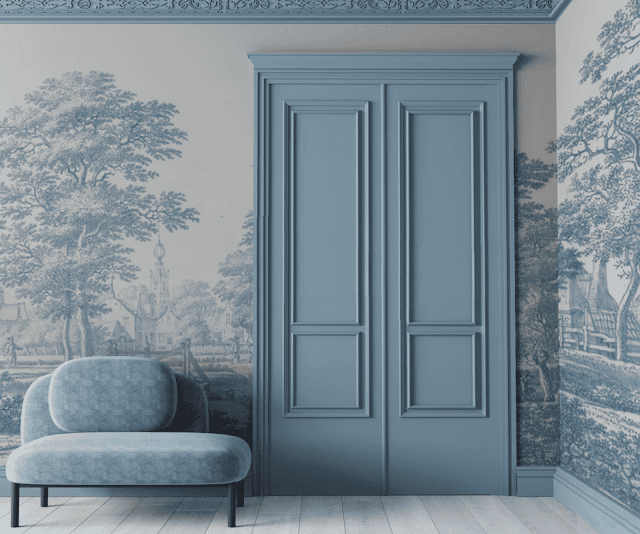
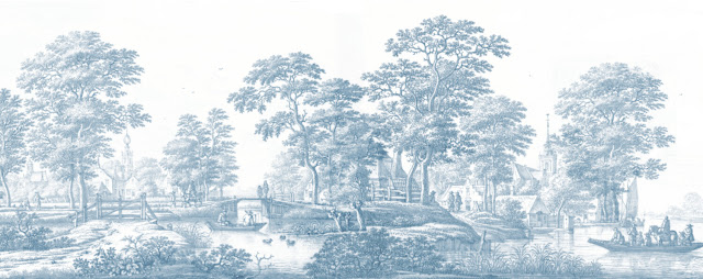
Decorating: A classic, timeless & elegant interior with wallpaper Italianate Blue

Would like to share with you this sophisticated wallpaper 'Italianate Blue' in a soft blue tone. It's perfect for a classic and timeless interior with an elegant touch. The Dutch company The Wallhouse NL is offering this beautiful wallpaper. The soft blue painted door as well as the moulding are matching very well. This blogpost is a repost of my post of 06-03-2022. Be Inspired .......

More about the designers  Anneclaire and Esmee
Anneclaire (Design)
Before Anneclaire started with The Wallhouse she gained experience as a designer at the company Adidas and she worked amongst other things as interiorstylist and graphic designer. She has graduated at the Amsterdam Fashion Institute (AMFI) for Fashion Design. At The Wallhouse Anneclaire is responsible for the design of the prints, advice and personalities. 

Esmee (styling and sales)
Esmee is an interior- and garden designer. She has a predilection for personal interior- and stylingadvice. She feels like no other how the designs of The Wallhouse can fit in your personal environment. 

Anneclaire and Esmee started in 2020 with The Wallhouse. With this formula they break open existing frames with the combination of different styles, personal attention and custom-made solutions. In this way every assignment becomes an unique experience. For more inspiring ideas, see their website or Instagram account, see the links below.

Thank you for reading this blogpost.
Sources: The Wallhouse NL and INSTAGRAM
e: anneclaire@thewallhouse.nl and e: esmee@thewallhouse.nl
For more Inspiration, see also my PINTEREST account

09 november 2024

Lighting Design: Beautiful Zoffany lighting collection by Heathfield (04)

While surfing on Twitter today I found these beautiful table lamps from the UK company Zoffany. These designs are great lamps to enhance and enrich your house in an elegant & stylish way. Zoffany has designed and created an exclusive collection of bespoke interior lighting In collaboration with Heathfield and Co. I checked both their websites and was very impressed about the glamorous and beautiful products they are offering. Just take a look at their websites mentioned below. I am sure you will be surprised. Earlier I wrote more blogs about Heathfield


Thank you for reading this blogpost!
Sources: ZOFFANY and HEATHFIELD
For more Inspiration, see also my PINTEREST account

18 oktober 2024

Design: Nymph lampshade for Poltrona Frau by Studio Sebastian Herkner

 Would like to share with you today this beautiful Nymph lampshade for Poltrona Frau by Studio Sebastian Herkner. Nymph is the first collection of lightings for Poltrona Frau. The Nymph lampshade is a one-off piece made of blown glass with ribbed workmanship, available in various finishes and in a small or medium size. Be Inspired .........


Thank you for reading this blogpost.
Source: Studio Sebastian Herkner
For more Inspiration, see also my PINTEREST account

20 augustus 2024

Interior Design: The inviting Knitty Lounge Chair by Nika Zupanc for Moooi

 
Today I found on internet this inviting Knitty Lounge Chair designed by Nika Zupanc, a designer from Slovenia. What a beautiful design! The Knitty Lounge Chair is about the pleasure of simple materials and transforming them into something unexpected that at first seemed impossible. Earlier I wrote another blog about this interesting designer, SEE HERE  Be Inspired ......


Interior Design: Best Winner of Year 2023


Nika Zupanc describes how her Knitty Chair takes inspiration from huge mooring ropes for ships. The Knitty Chair is an armchair with a chunky basket-weave design resembling a knotted rope. The chair is upholstered in a knitted fabric that features a quilted diamond pattern.
Zupanc explained the nautical inspiration behind the design in an exclusive video interview shot by Dezeen. "It was inspired by these very big ropes with which very big ships are tied to the ports," she said. "It is trying to change the perspective on things, playing with the scale that we are used to see in our everyday lives."

The Slovenian designer told Dezeen how Moooi champions emerging designers and allows them to realise products without compromising their vision. "Moooi was one of the few companies that had the courage to invite young, unknown designers to show their work," she said. "Big thanks goes to the product development of Moooi. They're always willing to go a little bit further to find the solutions and really try to do something great". This video was filmed as part of an ongoing collaboration between Dezeen and Moooi called Design Dreams, which explores how successful designers turned their dreams into reality.

The interior designer, Nika Zupanc

“Let it be full of love…”

More about the interior designer Nika Zupanc
Nika Zupanc traditionally makes careful selections of her themes and forms. With them she offers an exciting look at the predominately male furniture-design market, where all the aspiration is poured into the technical, rational, sober and utilitarian, as opposed to the intuitive, eclectic, vain and hysterical. To accomplish this Nika Zupanc uses her poetic judgment, inner battles with stereotypes and long-lasting affairs with technologies. She mindfully explores the limits of the industry when it comes to emotional effect and the juxtaposition of materials, both in product design and interiors. 

In international press, her work was described as everything from “punk elegance” (Elle USA) and “Techno chic” (Businessweek) to “larger than life” (Clear Magazine) and featured in number of relevant international press such as Wallpaper, Icon, Frame, Financial times, Elle Decor etc.

Thank you for reading this blogpost.
Sources: NIKA ZUPANC, DEZEEN and MOOOI
Note: This video was produced by Dezeen for Moooi as part of a partnership. 
For more Inspiration, see also my PINTEREST account

26 februari 2024

Wallpaper Inspiration: Peninsula Palm from the UK brand Harlequin (01)

While surfing on Twitter today I found this beautiful wallpaper from the UK brand Harlequin. This one is from the serie "Anthology" - Peninsula Palm. It really gives a warm atmosphere. Love the Oriental-inspired trailing palm design too. This wallpaper is also available in other colours, see the enclosed link below. 
Thank you for reading this blogpost.
Source: Harlequin UK

15 december 2022

Decorating Ideas: Chique wallpaper by Vincenzo D’Alba for Affreschi & Affreschi

While surfing on internet this morning I found this chique wallpaper from Affreschi & Affreschi. This collection is called 'Season 1' and designed by the Italian designer Vincenzo D’Alba, masterful reproduced on handmade, mineral plaster sheets. Very inspirational design! Be Inspired ......

More about the company
Affreschi & Affreschi is an Italian company that produces frescoes and decorations on a thin layer of plaster that can be glued directly onto the wall like wallpaper. All works are made here in Italy at their place, after that they ship decorations directly to your place, ready to be installed onto the wall.
Composition
The difference can be seen and touched by hand. 
All the Affreschi & Affreschi designs are reproduced on fresh plaster sheets. It is therefore a special wallpaper covered with a layer of plaster obtained with a mixture of 27 precious raw materials among which Carrara marble and Roman travertine, on which the masterpieces of Italian art history have been carved. Imagine having the marble chips fallen while Canova, Michelangelo, Bernini and Raphael sculpted the works that made them the greatest in the world. Nowadays, with the same material, we get your walls covered to make them real masterpieces. The output is a natural surface, to the touch and to the sight, that evokes that of the ancient frescoes made to measure and finished with care in every detail so that the chosen design emerges in all its beauty .......

Thank you for reading this blogpost.
Sources: Affreschi & Affreschi and Behance

24 april 2022

Decorating: Elegant wallpaper with peacocks & flowers by Graham & Brown


I guess long-time readers discovered already how I love wallpapers ..... While surfing on internet this morning I found this beautiful wallpaper called 'Resplendence Blush' designed by the company Graham & Brown. It's a new version from an old design from their archives. Such an elegant and refined wallpaper with greenblue hand painted peacocks and pastel yellow flowers. They contrast beautifully against a soft pink background. Be Inspired by this sparkling wallpaper from Graham & Brown. In the past I wrote more 'Wallpaper' blogs, see HERE 


Thank you for reading this blogpost.
Source: GRAHAM & BROWN